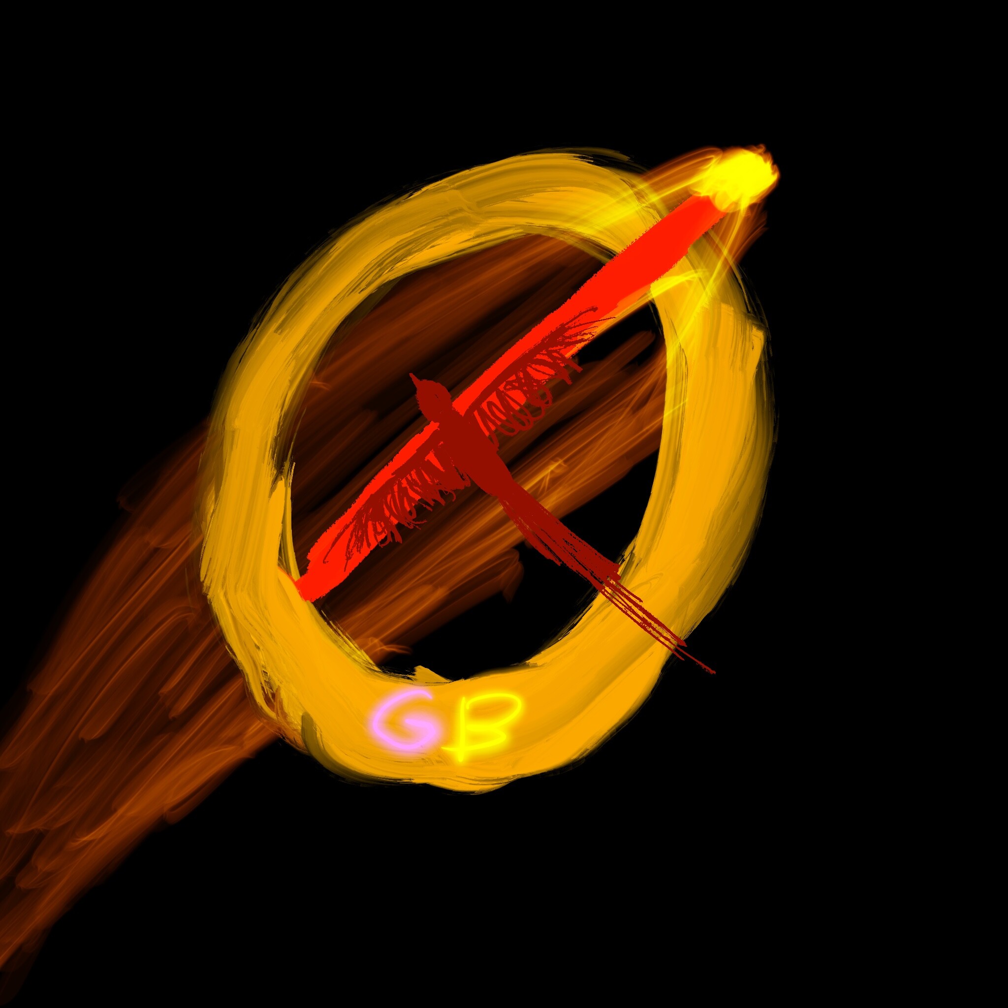
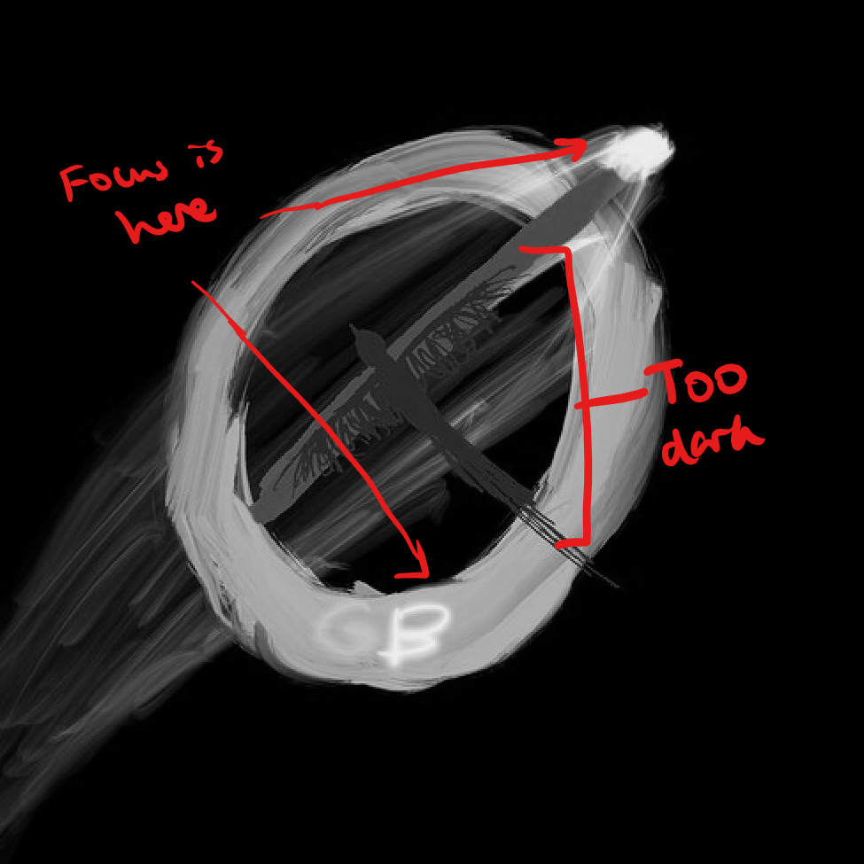
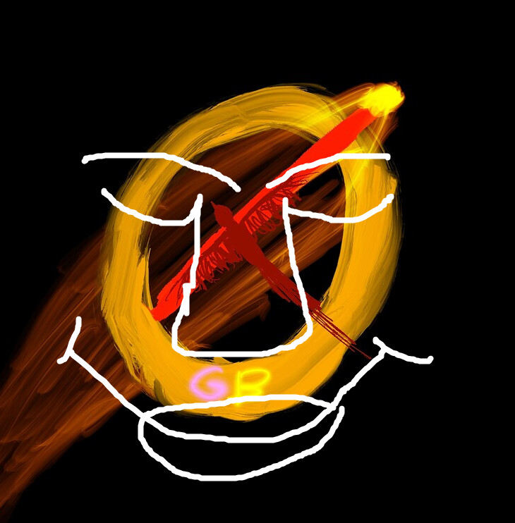
a tip for digital art is to focus on value (how bright or dark it is).
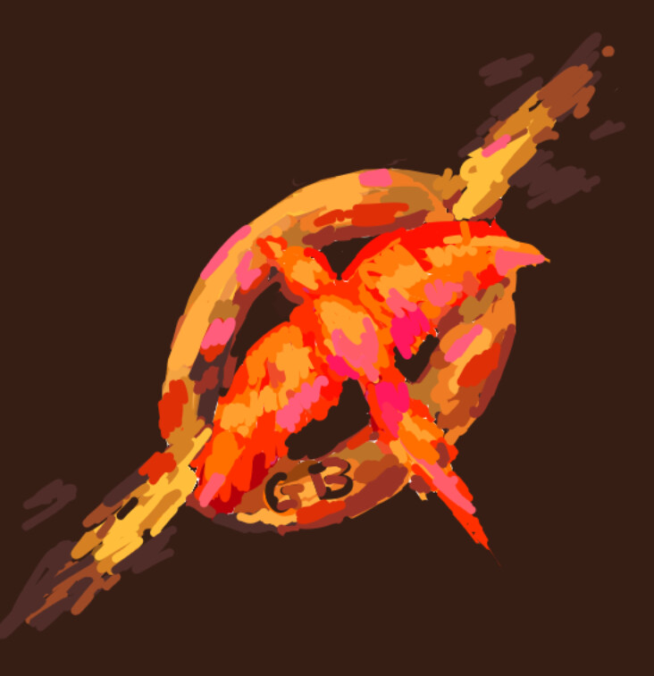
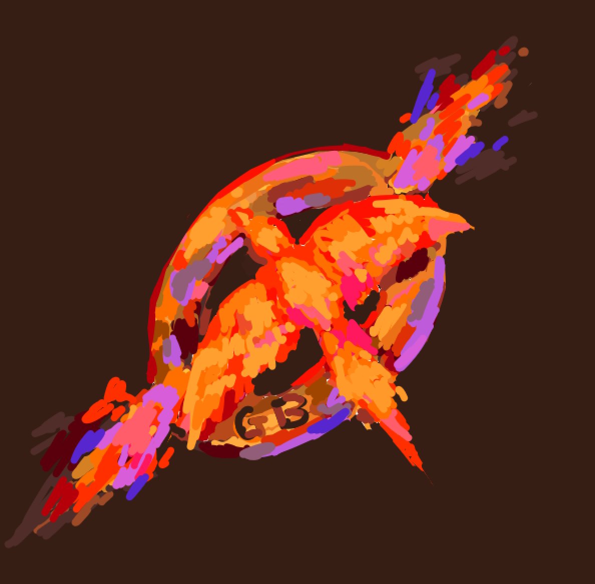
For example, in your profile the bird is very difficult to make out as it is too dark. Additionally, the focus is being drawn to the brighter areas of the artwork on the ring instead of the bird. Using a pure black background also makes everything very sharp and highly contrasted, I use a darker brown here to make the general feel brighter and warmer
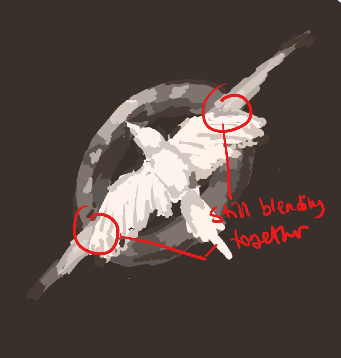
When colouring, you can also use different hues to create better contrast and focus. Here I used more desaturated yellow-brown colours for the ring and added some purple lighting*, while for the bird i used very bright and saturated reds and pinks.
*Purple is also complementary to yellow so adds a bit more contrast.
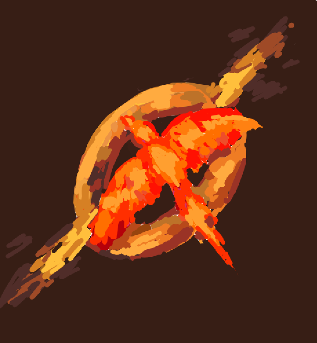
also note that using fancier brushes ≠ more realistic artworks, masters can make realism with a hard round brush and good understanding of fundamentals like value. Realism is also more important for studies imo