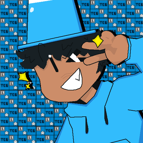
What do you guys think of it? Should it become my new PFP or no?
Not dissing you skills but @AbstractDesigner 's Pfp looks better. Again, No diss it still looks cool
It’s alright! I can’t make pixel art like that lol
Do this I love this
Okay, I did it. I had to change the font of the letters TCG because they were a little too hard to read ![]()
It looks pretty good!
Ratio
Jk, It’s okay if you disagree but imo this goes extra hard ![]()
Dude, WAT?!
I can agree with that.
Ayo, when you put it like that…
Ratio? Here’s a Wikipedia article about it, it will probably do a better job at explaining it
Another common form of ratio is when a reply or quote retweet (typically expressing an opposing viewpoint to the original post) gets more likes than the post it is replying to, signifying that more people agree with the reply than the original post. Twitter users may “initiate” a ratio by replying or quote retweeting a tweet with the text “ratio” in the hopes that their tweet acquires more likes and/or retweets than the tweet being replied to. They may not always succeed; a “ratio” tweet that does not achieve this is known as a failed ratio or flop.
Lol ok (as I said, I live under not only a bed, nor a rock, but bedrock).

I made this one too, not sure if I should use it-
Use it
Just a question, but how is there sweat on the cone?
is the cone a part of the characters body?
just confused. The banner is really good though.
It was supposed to be a shine on the cone, but I’m not good at drawing that-
This looks awesome! What did you use to draw this?
I mad it on an online art program called Pixilart. You can find it here.
I aready know Pixilart! I found out about it before Makecode, but I deleted my account ;-; I’m pretty sure I still have my second account tho…
RIP your first account ![]()
I usually use it just to make art, although I’m thinking about making an account…

