Drawing custom card rotations is not a good move in the slightest as the number of assets is already ridiculous. I would have to handmake literal thousands of new card assets, hundred of times the current amount (108) to make every possible card rotation.
I don’t think you understand how the code functions, for every hand size increase, the card rotations are all different. So hand size 8 will have completely different rotations to hand size 11 for every single card.
Also this is all pretty moot because writing legible angled text is like impossible in a tiny pixel space.
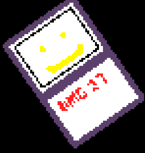
It’s a new mini update V0-42-2 ! I’m using @BLADEr’s rotation extension to get even cleaner sprite rotations and reworking selection to look better. Now you can also cycle through infinitely in either direction. @Bifrosty i also think the text is actually pretty readable!
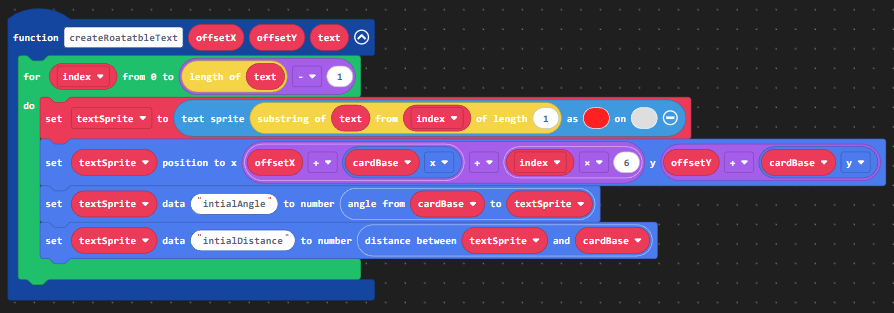
You don’t need to draw individual rotations for the entire card! Don’t rotate the image of the text. Here’s how to do that.
I just looked at your code. (Rly good art btw) You individually copied each card frame onto every card. That’s inefficient and probably wasted a ton of time. You should add overlays for the frames and the text to help with legibility and simultaneously save time.
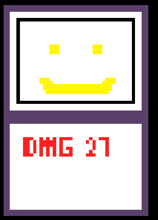
1.Draw your card like normal, but this time draw your frame in a separate sprite.
4.Use induvial sprites for letters (I’m just going to use the basic text sprite extension but you could use your own font.) You can make a function to split up individual letters from a string of text.
You can add an offset from the center of the card. Use an index loop to move each letter further to the right.
This method will save tonns of time because you don’t need to draw extra images for every card frame and as a bonus your text is easy to read! Here is my example:
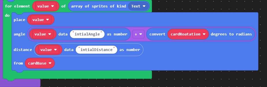
I would honestly love to see this work but there’s a few issues that should be addressed. Thank you for the help though! Using sprite data of angles and distances to position them is a great idea
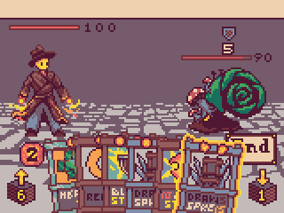
1). Using more sprites is a huge no. Card Delver already has a massive lag problem, I use 2 sprites for every card - a positioner and the card image and I still experience really poor performance at larger hand sizes and when starting events that load the deck.
2). Custom textsprites will not be so simple - in your example the card is much larger, giving a lot of extra space to place your text. In Card Delver, most text is crammed into a space with 1px precision. I will try and see it would work though
3). Adding card frames as an extra step is unnecessary, I’m not too sure why that was over complicated. There are very few circumstances where I would use the same art for multiple card types, i try to make each type unique.
oh LMAO i thought you were talking about the updated version too
(i’ll still try and code this since it sounds like a fun challenge)
So my project that used the share link kind of got nuked, I think ill forget regularly doing small updates and just release larger ones more infrequently. It was probably because of chrome crashing out of memory and also makecode making a bunch of copies due to my project “being edited in another location” (even though I had worked on the code in one session)
yeah, i definitely agree everything is really squished up against each other. I did run a poll a few years back but it seems a bit contentious. Theres several reasons why I’m considering it:
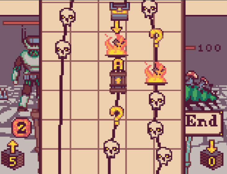
Status effects - These are always hard to read, always being relegated to the bottom of the screen where cards are bobbing up and down covering them. Increasing the screen height will make them much more visible.
Summons - Right now, theres already problems with enemy summons overlapping and just making a horrific garbled mess. If and when I add player summons, there simply won’t be enough space to handle that extra sprite. Increasing the width of the screen by 2x would fix this.
Items and coins - creating a UI bar up top for these elements will be much nicer if I have more room to play with
Enemy intents - I want to add larger boss sprites but with the current system their intents will simply not be visible
A side by side comparison to Slay the Spire (the game’s main inspiration) shows that i can definitely increase the height and width while keeping everything readable.
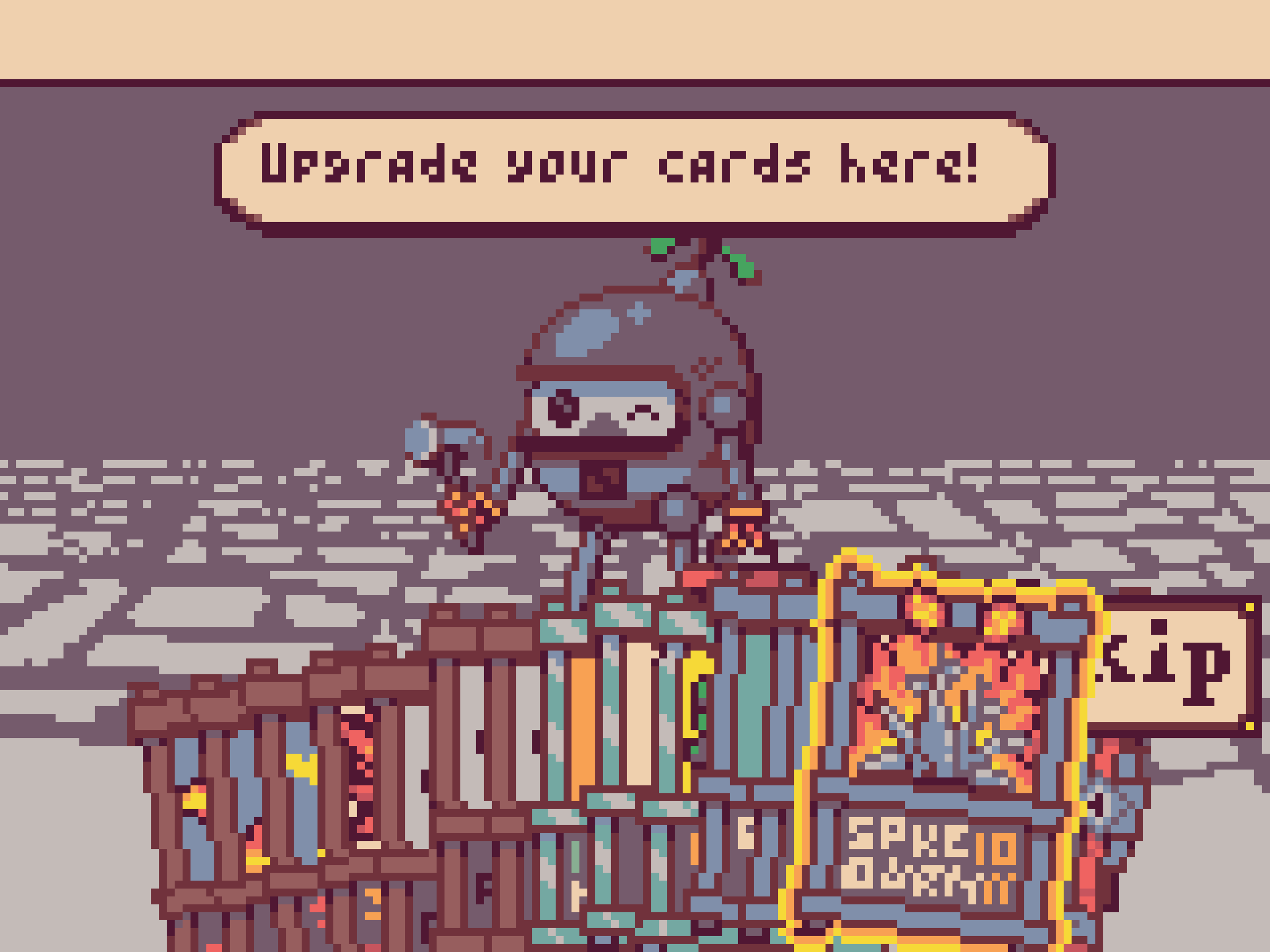
really cool game but if I was to say one thing to improve on it the background Maby make it look a bit more interesting or Maby even layer but it an amazing game