I like that
3 Likes
I made this character chart a while ago when I was first thinking of the story. These characters might change, I was just thinking of characters that would fit into the D&D alignment:
First row = Good
Second row = Neutral
Third row = Bad
WORMS:
| Lawful | Neutral | Chaotic |
|---|---|---|
| Bartender, Other Family Father | Victim’s Mother, Other Family Mother | School Teacher, Other Family Son |
| Victim’s Father, Sister’s Friend | Victim’s Sister, Hotel Manager | Town Chief |
| Victim’s Girlfriend, Security Guard | Victim, Hotel Neighbor, Hotel Maid | Town Artist, Victim’s friend |
OTHER BUGS:
| Lawful | Neutral | Chaotic |
|---|---|---|
| Tourist Dragonfly | Tourist Fly | Celebrity Beetle |
| Janitor Ant | Praying Mantis Hippie | Tourist Bee |
| Hotel Neighbor Tic | Hotel Worker Cockroach | Gangster Mole |

@Luke, what can you tell me about this palette? I wanted to go with a minimum of 4-8 colors:

4 Likes
The red ramp could do with more hue and lightness contrast
2 Likes
You should add a guy that very obviously did the crime but turns out he didn’t, then in the end you find out that he was the friend of the guy that did the crime and he wanted you to suspect HE was the guy, so that his friend wouldn’t get in trouble.
4 Likes

I changed the last three colors in the red ramp. I saw that the middle two were too close in lightness and color, what do you think?
3 Likes
The D&D alignment chart may be bad for actually playing D&D, but I will admit it works great for making nine distinct characters very very fast.
2 Likes
I think you should try pixelling a few demo spites to see how well the palette works and if you need to tweak stuff slightly
3 Likes
You’re right, there should be a better way for D&D, but it is nice for making quick personalities!
1 Like

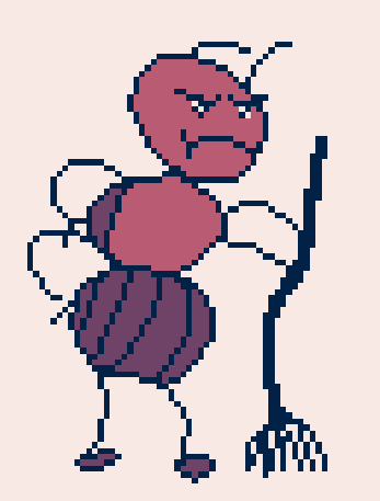
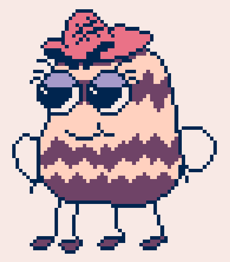
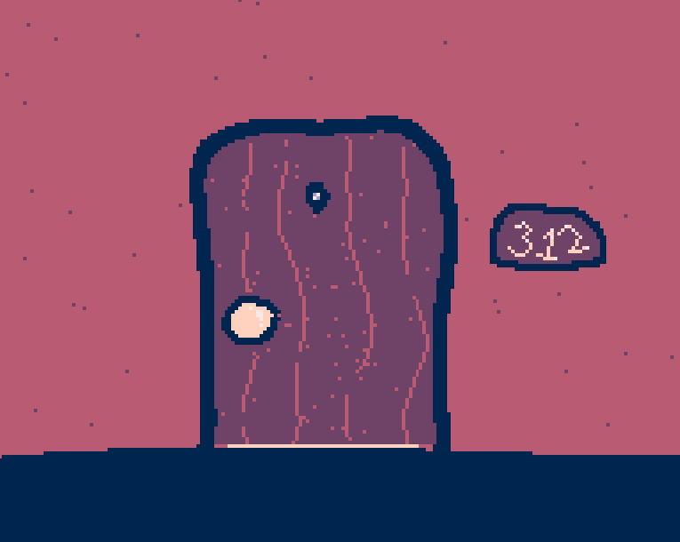
That helped a lot! I like using the dark blue as an outline, so I decided to darken it. This way the dark purple can also be used as a fill color. Thanks Luke!
5 Likes
What do you guys think of this font:

10 Likes
It looks perfect for the game, very handwriting-y.
The only problem I can think of is that it may be too big. It would be hard to fit a testimony on screen.
2 Likes
Maybe it could be a bit thicker
it might look better if it was a pixel thicker but I’m not sure
Actually, yeah. I see it might be too big for that kind of stuff…
@Rune, should I make another smaller fonts; so there’s two fonts in game?
@YamJam, @TheEarth, I’ll make the font thicker to test how it looks, but the thin letters are probably what I want for the game.
3 Likes
Yeah that’s probably a good solution.
2 Likes
LOVE THE FONT yes makecode its a sentence
3 Likes