woah looks way cleaner! Love the repositioning of the elements and the helpful titles. I have a few suggestions though 
Image settings
I think that Convert and Resize should be renamed to Apply Changes and the image should automatically load intially as I got a bit confused where my image was
The Apply Changes button should also be at the bottom of the website (but make it noticeable as it’s pretty important) and placed seperate from the other image settings so it’s clear to press it after doing all the other stuff on the website.
Filter and dithering settings
I would change to: Filters and Dithering as it’s also clear that there is a drop down menu to read through
i think these 2 subheadings don’t need to exist, it’s pretty clear from the title what the menus do
Variable and Conversion
I would rename to: Export Image as the variable naming is not very important. Conversion might also be confused with the filters and such.
For the copying images, the makecode image editor can actually handle copying images directly, which is useful for larger block projects which can’t switch into javascript. So maybe add 2 buttons, as Javascript code and for Image Editor under a Makecode Arcade subheading
Copyable code
img`
. . . . . c c c c c c . . . . .
. . . . c 8 7 7 7 7 8 c . . . .
. . . c 8 6 7 5 7 6 7 c . . . .
. . c 8 c 8 6 7 5 5 7 6 c . . .
. . c 7 6 c 5 7 5 5 7 c 7 c . .
. c 6 5 5 c 6 7 7 7 c 8 5 7 c .
. c 7 5 5 7 7 7 6 c 8 7 7 7 c .
c 7 c 7 7 6 8 7 c 6 7 5 7 6 c .
c 7 c 8 c c 8 f 8 c c 7 6 8 . .
. c 8 6 f 8 f 6 f 8 c c 8 f . .
. . c 8 6 f 6 7 f f 6 f 8 . . .
. . . . 8 6 7 7 7 6 f 8 . . . .
. . . . 8 7 f 7 7 f 8 . . . . .
. . . . 8 7 7 7 7 7 8 . . . . .
. . . . . 8 7 7 7 8 . . . . . .
. . . . . . 8 8 8 . . . . . . .
`
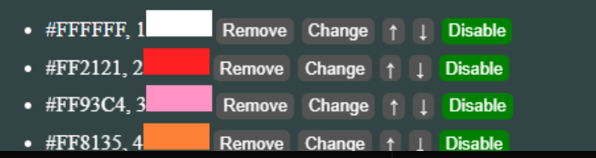
Colour Management
I would change to: Colour Palette
This also feels a bit clunky, maybe make it a numbered list instead of a bulleted one so that you dont need the numbers rubbing up with the colour boxes.
I also think that clicking on the colour could change it instead of having another button do it. Also the colour boxes could be rounded off and aligned with the text and each other as they’re slightly off (not that important tho just my ocd lmao)
I think that the ability to import colour palettes is pretty important tho, it’s something that the
pxt-arcade-asset-tool has (but it’s broken for me

)
Overall
Moving to aesthetics, I think that a consistent and more interesting font would be nice, perhaps bahnschrift, roboto or futura. Or you could use 2, one for the titles and another for the smaller text!

All the grey clickable boxes being consistent with the drop down menu’s style and also having the same padding as other elements would make it look better (again just a visual thing)