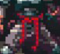
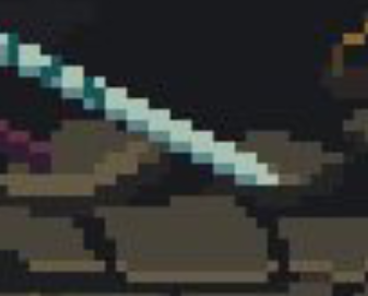
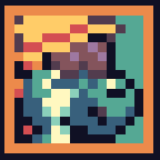
even dark and moody games have good contrast, only using colours that are very dark makes it hard to make out details. I would look at the game Blasphemous for inspo. Notice how the character has key elements that are relatively bright, the red sash, the sword, the shine of the metal.
In general, you want there to be contrast with the character, and the environment so that the player stands out. This is usually achieved by making parts of the player brighter. (like the metal armour) You can also use more saturated and brighter colours to do so. (like the red sash)
What makes the game feel “moody” and “dark” is actually more down to the more detailed pixelling, use of desatured colours, and darker backgrounds (which help draw focus to the character and set that darker ambience). If you only used dark colours, your game would just be difficult to see properly.
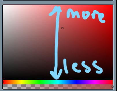
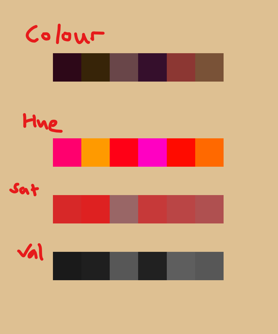
every colour can be thought of as made up of 3 components, each unique colour made up of different “levels” of them - Hue, Saturation and Value (aka brightness)
Its essentially controlled by 3 variables.
Hue is the true “colour”, its what you traditionally define as colours (red, green, blue, yellow)
Saturation is how much of the colour there is, its like how concentrated it is. Think neon vs pastel for bright saturated colours. Remember that you can have saturation for both dark and light colours.
A great example is the colour brown, which can have an incredibly wide range of different hues from yellow to purple, but tends to fall in the same low saturation and low brightness.