you see guys I am a man on a mission to maybe just MAYBE be at the top and make the best makecode arcade game on this platform! So as you see I need you to lend you your waisted time when you should have been touching grass for once and critique this game BIG TIME I every little minor flaw must be told to me under this comment section and in some years you will get dang quality title that I want of course yet again to be the best makecode arcade game on this platformer
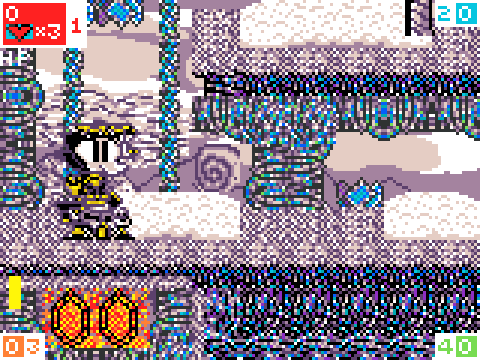
here’s another pic because I’m feeling a bit generous
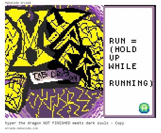
same here, bud, I don’t mean to be rude or anything but the screen looks a bit static-ish? I mean, if that’s your art style, its all good, keep up the good work, but maybe improve the visibility?
Basically, what everyone else said, it’s hard to see what’s going on with all the dithering, it just looks like an ultra-sharpened image (if you’ve worked with the photoshop sharpen tool, you’ll know the artifacts it produces)
ugh. My eyes. They hurt. Listen, I think the artstyle is nice, but it is a bit too much. the first time I saw this, I thought it was a pixel clump. (except for the head)
I heard the criticism about the game and in retrospective I think I overlooked how the textures looked really, like how Static and how the snow effect started to not look like snow do to me using all the colors in the color pallet currently I’m trying to change the graphics to not look look like static but still trying to make the game look real. and if your wondering why the head of hyper is the only thing that doesn’t look like pixel static his entire body I tried changing the sprite to look more real and update with the new character design with what it’s suppose to actually be he looked to spikey and I forgot to draw is weird looking rocket tail thing and I was lazy at the time to update it and a really old sprite of this character I thought when it didn’t let me make a normal link for people to play I thought it was because of the design and how badly it translated to pixel art when I made it at the time.
.
.
.
.
.
.
.
BUT do critique even more and if your wondering that I felt like if I felt sad because of the loads of criticism I’m getting in this comment section I’m completely find so you guys can go into a rant in the style of the angry video game nerd because I am listening to the problems about the static, pixel clump, visibility issues, that one sign I forgot to change for a couple a months in the game , AND DEFINTLY the song playing the background.
yeah yeah yeah alright pal you see this game over here
this game has of course a lot of reasons play this game like
1.a big bit of 16 bit graphical quality,
2.a big bit parallax scrolling,
3.a big bit of a extremely 90s y2k fearing mascot,
4.a big bit of quality music,
5.a big bit of replaybility
6.a big bit of poles
7.a big CHUNK of pixels
8. a big bit of not 8 bit
9. a big bit of something that kinda looks like a place which was formally know as the artic lowlands commonly know as your mom
10.a big bit of gems not cash gems because I love spyro
11. a big bit of exploration none of that speed running coodies
I will add more in the second post because this is of course a real quality game
12.a big bit of no thilsy loot boxes
13.a big bit of no cones insight in this game
14.a big bit of no money included to play this game
15.a big bit of spending your time doing the real thing that matters in life
gaming
16.a big bit of NO BLUE HOODIES ONLY BEE THEMED ONES
plus here a new version of the game randomuser, conguy, brohann, grimm9, edrianx, some box guy, and taser mc no razer because of course he doesn’t have a beard on his pic and some more I forgot… uhhhhhhhhhhhhhhhhh