Chopped Chin
4 Likes
Phantasia, particularly aphantasia can actually improve some types of thinking. Like logical and spatial awareness. (It also means you don’t really have dreams or nightmares, at least not clear ones.) Something like 1-3% of the population has severe phantasia or aphantasia. Interestingly enough, my brother also has severe phantasia. I do think that it is entirely possible to be good at art and have phantasia, it just makes it harder.
Damn!
Also please do a geometrical pattern weekly! Maybe it would appeal to some people who usually don’t do the weekly art challenge.
4 Likes
i have it too
3 Likes
27 Likes
Love the lineless style!
3 Likes

13 Likes
The doctor is pleased ![]()
Although I do look somewhat cursed with the teeth and all, my pfp has no mouth
10 Likes
I was going to do Taser… I can’t make the hat though.
3 Likes

17 Likes

omg omg omg Richard liked my post omg thank you so much
3 Likes
i used the circle tool lol
2 Likes
@Luke i was wondering if i could get your opinion on art for game design. I’ve always worked makecode and the 16 color palette, but now that i’m also using godot, i use a website called piksel. With unlimited colors, many of my palettes turn out dirty or ugly. Same for the sprites, shading wise and scale wise. I love your art work, and are there any tips on improving?
3 Likes
Go to lospec and have a look through the palettes. Notice how so many of the ones that are popular are very small, most palettes are around 16 colours.
Smaller palettes are great, they may be more restricted but this limitation makes it both easier to use and also more cohesive. Always cut redundant colours
My tip is to start small when building palettes. Choose a handful of hues you want in the palette (eg brown, blue, green) and build small ramps of colour for each one from dark to light. Try to reuse colours across different ramps where possible.
Important note:
You can think of colour as being made up of 3 components, hue, saturation and brightness. Focus on hue and brightness for now and try not to overthink saturation since that’s more difficult.
BRIGHTNESS
The overall trend of a ramp should be from dark to light, it’s brightness increasing (think of it as like black to white if it were in greyscale) This can change depending on how pastel or dark or contrasty you want the palette to be.
HUE
The hue of a colour is closely related to its position on the colour ramp. Darker colours tend to be cooler, tending towards dark blue on the hue slider
Brighter colours tend to be warmer, tending towards yellow
(this is because shadows are not in the warm light of the sun, this helps make these hue shifted palettes feel warm, vibrant and realistic, impressionist paintings are excellent examples of exaggerated hue shifting like this)
Examples:
warm blue is turquoise, cold blue is ultramarine blue
Purple → Red → Orange → Yellow is getting warmer.
Yellow → Green → Turquoise → Blue is getting colder
SATURATION
Saturation is an interesting one. I usually like to keep the saturation low up the ramp (where the brightness is high) and increase it down the ramp. (Mimics exposure from strong light) Saturation can be heavily changed through, red line palette has full sat high up in the ramp. Human skintones usually have the saturation peak in the middle of the ramp. So with saturation follow the general rule of get less saturated if it’s very bright but it’s quite a flexible one. This also goes with the other rules, there’s palettes with low brightness changes that are carried by big hue shifts and vice versa.
7 Likes
in piskel I use 24 or 32 palettes
2 Likes
when’s the next weekly art challenge?
3 Likes
Can we have another Art Challenge?
3 Likes
Alr bro you are super mega ultra awesome
3 Likes
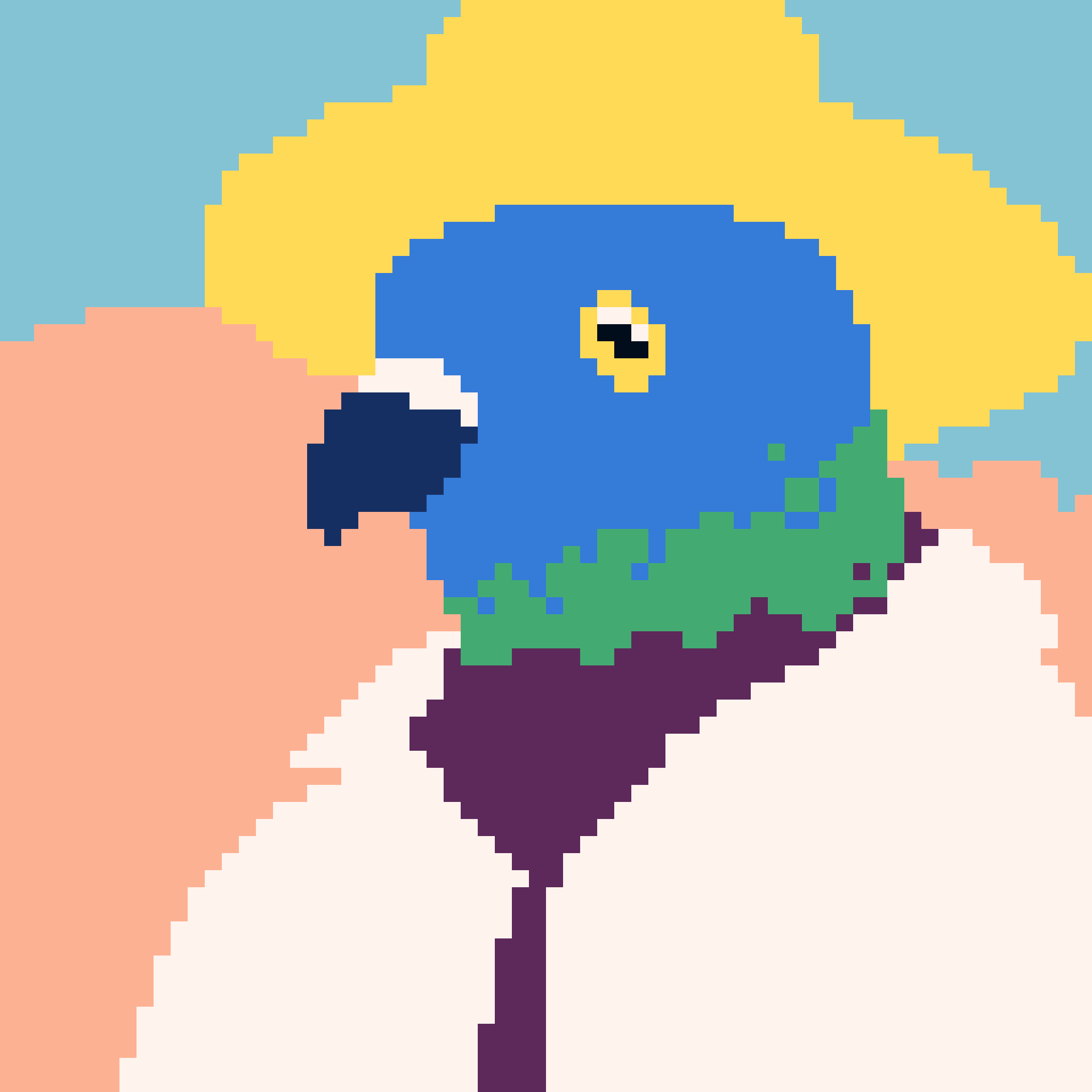
Weekly #27
Promt: Realistic portrait! I recently did 2 when making a palette example (for a bonus difficulty do NOT draw any boring fully front on or side views, do an interesting angle like below)

Aforementioned palette: (focus on using one ramp of 4 or 5 colours, having too many colours to work with will make a face even harder to draw)
Resolution: 67x67
my main tip for this one is:
- don’t get too caught up on drawing the features of the face individually as isolated parts and trying to make it look good by itself (eyes, mouth, nose etc).
Try to visualise it as topology or a change in elevation on the 3D shape of the head.
eg: These don’t need to look like eyes by themselves, instead every other part of the portrait will help your brain form that connection


The other helpful thing is to remember that the main features tend to lie on the 1/2, 1/4 and 1/8 for the eyes, bottom of the nose, and lips


- And finally try to ignore any preconcieved notions of what you think the face looks like. You will most likely be wrong. Instead pull up a reference and look at that instead.
btw feel free to ping me for help, i still struggle with faces and if you need a clearer step by step plan ill be happy to create one.
8 Likes
And that…
Is what I cannot make.
6 Likes