Maybe an accent color…? At least some blue or something so we can give clear blue skies to our dusty deserts?
1 Like
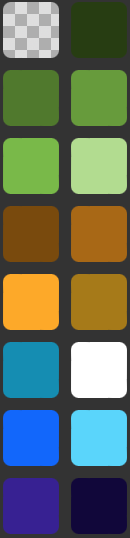
Hmm a few thoughts
- The palette has too many colours that are essentially the same - pixel art is all about limitations, keeping the colour count low. Removing redundant colours is also important to keep the piece from looking like a blurry mess as yr working with such a small canvas
- The hues are all the exact same - this might seem fine, but adding hue variations helps make it way more interesting - eg Zelda’s face on ur pfp has a ramp from red → orange → yellow, the colours in gilded navy seem the same but they have some slight hue shifting
This is how I would improve the palette V

9 Likes
Wow um… my bad looks like I chose a bad color pallete I was just thinking more like a Dune color.
2 Likes

I think it would be better to make the “lightest green” even brighter than the “lightest yellow.” That way, there can be more values from darkest to lightest. Also, the blue and Cyan are too similar, just make one darker than the other. Other than that, it’s a good pallete
1 Like
Looks like bob rosses color pallette
2 Likes


WOW how do you do that?
4 Likes

You… Got… His… Profile… Pic?
Ah copy sprite! “I finally got that!”
Jokes aside, nice art!!! I didn’t even attempt this one because 160 by 120 is LOTS of work and I am making a big game.
7 Likes
THAT IS INSANELY ACCURATE HOLD ON
6 Likes
Wow I’m so ![]() !
!
7 Likes
I know this is kind of late, but here’s mine
based off of Galileo’s telescope
10 Likes
Luke…I really want to do another art challenge…
2 Likes
Theme: Magazine! (maybe make a makecode magazine cover???)
Resolution: 105 x 149
Palette:
very cool example by Brandon James Greer (also a vid on it)

15 Likes
𝐁 𝐄 𝐓 (𝐬𝐞𝐧𝐭𝐞𝐧𝐜𝐞)
2 Likes
Interesting
I will give it a go.
4 Likes
@Luke Yes!!! I will give it a go but this one looks hard.
3 Likes

oooo simple but effective!
7 Likes