sorry it’s not done!
2 Likes

Aang
4 Likes
Aang?
3 Likes

It doesn’t look like a coincidence…
The art looks good either way.
11 Likes
Theme: Celestial
Resolution 160x120
Palette: (by me!)
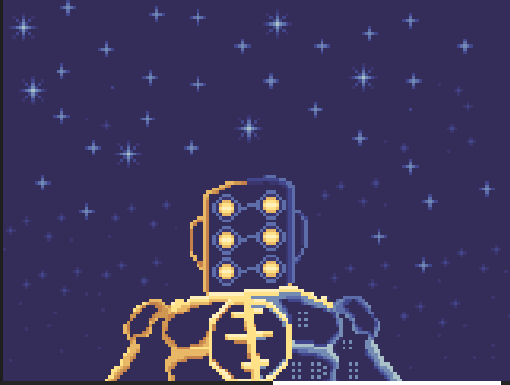
some cool inspo from Arcane (minor spoilers for second image!)


10 Likes
I think I might do Arishem the Judge (Marvel)
1 Like
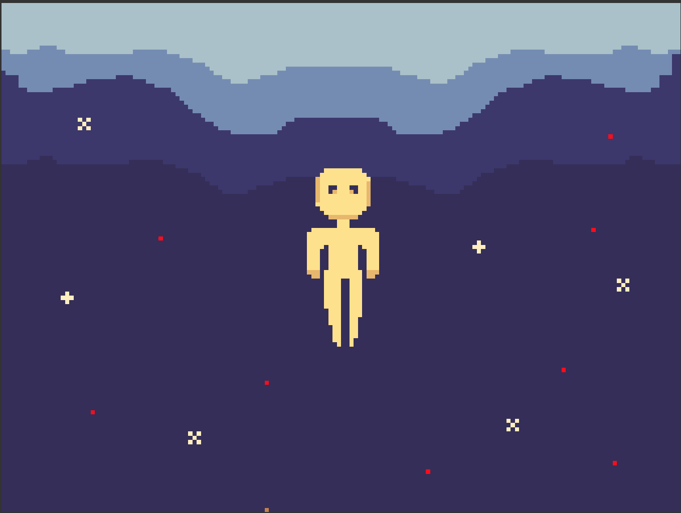
I have never done the weekly art challenge before but I would like to get better at sprite art so here is my Submitionm based off of Lukes picture not great but of first try not bad.
10 Likes
woah super cool!
(red is NOT part of the palette tho lol)
5 Likes
3 Likes
@Luke could this next art challenge have this color pallet? I think it would be really cool and fun.

2 Likes
Oh lol thought the 4 reds were included.
1 Like
Damnnnnn this is peak
Maybe an accent color…? At least some blue or something so we can give clear blue skies to our dusty deserts?
1 Like
Hmm a few thoughts
- The palette has too many colours that are essentially the same - pixel art is all about limitations, keeping the colour count low. Removing redundant colours is also important to keep the piece from looking like a blurry mess as yr working with such a small canvas
- The hues are all the exact same - this might seem fine, but adding hue variations helps make it way more interesting - eg Zelda’s face on ur pfp has a ramp from red → orange → yellow, the colours in gilded navy seem the same but they have some slight hue shifting
This is how I would improve the palette V

9 Likes
Wow um… my bad looks like I chose a bad color pallete I was just thinking more like a Dune color.
2 Likes
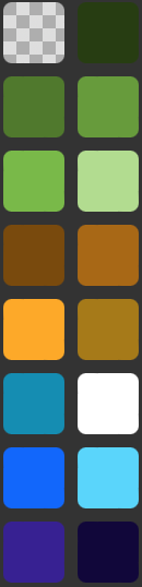

I think it would be better to make the “lightest green” even brighter than the “lightest yellow.” That way, there can be more values from darkest to lightest. Also, the blue and Cyan are too similar, just make one darker than the other. Other than that, it’s a good pallete
1 Like