Like what @_jupiter does currently, just some simple art to compliment the article. You can make some posters as well, since you’re so good at it!
4 Likes
yeaaah we do kinda need a poster (do we?)
3 Likes
Definitely! What do you think @CodePerson
2 Likes
colour relativity is fun
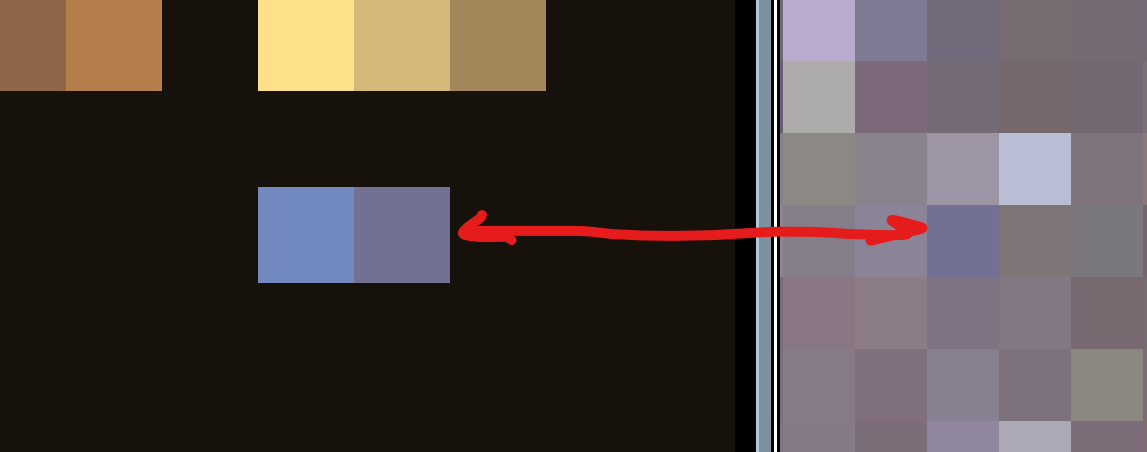


these are the same colours!
(this is why colour ramps as well as the palette as a whole is super important!)
7 Likes
Sure!
2 Likes
@RobbyZero give him the invite
1 Like
Do they have GitHub?
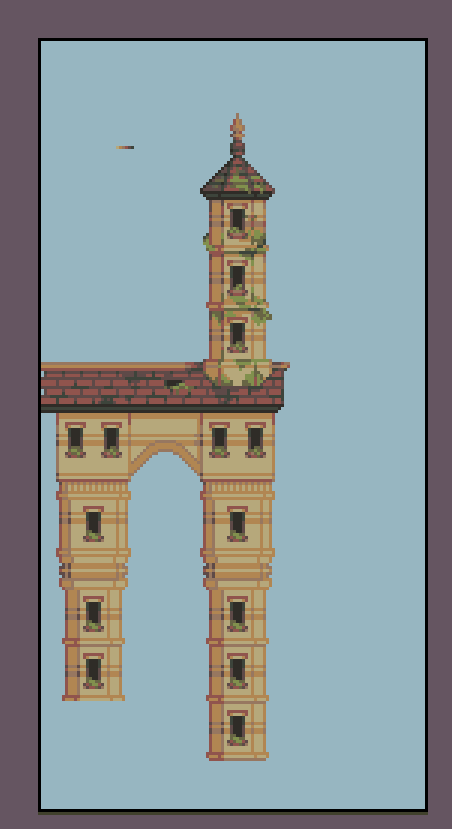
Theme: City
Resolution: 128x256 (or 64x128 since thats a bit daunting)
Palette:
Inspired by townscaper, go check it out it’s a very cool game! (or tool?)
also tip, don’t be afraid to copy paste a section, architecture is about balancing the structure of repetition with the uniqueness of chaos.
this one is my own build!

these are just some sick examples of stuff ppl have made


13 Likes
Uhhhhh…I dont know?? @CodePerson do you?
nope, sorry
Also probs going to be working on weekly art challenge for most of the week. Once i finish the poster, do you mind if i just post it on the normal topic, or should i do something else?
3 Likes
Usually we assemble the news on github, then we can post it here. That includes art. If possible try to make a github account because that makes communication way easier
2 Likes
Wow that is amazing! but I don’t think this one is going to be appealing/easy for me. Might try the next one.


Inspired by some floating Minecraft islands I’ve built, as well as the floating castle from Castle in the Sky (one of my favorites!)
17 Likes
Omg you guys, this looks insane!!!
@WoofWoof I absolutely love castle in the sky too!
7 Likes

THE COOKING IS GOURMET ![]()
![]()
![]()
13 Likes
was going to reply, ended up with a longer post so ill put it here
fun fact i almost never use pure white or black in my art! I find that the best palettes have slight tints and shade to their darks and lights as that is more akin to how we percieve things in real life.
I also find that it’s hard to use in many palettes because of how strongly contrasting it is
- colour is very relative so having both extremes of brightest and darkest affects yr other colours.
I would use pure white/black maybe if it was a smaller, stylised colour ramp.

you can see the difference quite clearly in this recent weekly i did
a lospec daily i did with pure white and black:

edited vers (only changed black and white)


*i prefer the last 2, the first is still a very apealing style, i just think that it’s much harder to do well.

another great example of tinted whites (and darks!)
give gordo some love!
13 Likes
Ok I thought luke was just damn good. I can’t believe I’ve been on the same forum with a 21st century Van Gogh. Not only that, he knows the homework too :o
7 Likes