I’ll probably make something else.

13 Likes
omg i love it! also the lil cat is great :D
3 Likes
can we just appreciate how good copy has become at making art? i didnt even realise he was that good, his style is so recognizable as well! good job!!
7 Likes


here’s mine! I’ve been experimentig with the shadows and showing depth in the face in low color based in pixil art for a bit now, and this one is kinda rough but I also rushed it a bit
13 Likes
time to make my weekly art
LUKE LUKE PLEASE HELP PLEASE LUKE PLEASE
MAHORAGA
MAHORAGA HELP HELP MEEE
9 Likes


spooky!
3 Likes
I didn’t really get the theme here, but I tried my best on a large scale one.

Must I use every colour in the palette?
9 Likes
um the point of the palette is that it’s supposed to be restrictive - part of the fun is that you’re only using colours part of the wordle palette
also why makecode default palette ![]()
6 Likes
yes i would try to use them all (especially since theres only 4 in this one).
If the palette is like 32 colours then yeah i could see why you wouldn’t use them all but for small palettes each one is super important. So removing one changes the feel of the artwork a lot
6 Likes
Ok. Thanks so much!!!
3 Likes

Please just use 4 colours - if you look at the example art I made i use a ramp of yellow → green → grey → black.
You’re falling into the trap of trying to shade things with the “correct” colours - hay is only yellow shades and pumpkins are only green shades. But that doesn’t work when there’s only 4 colours to play with so you’ve ended up with extra yellow and green shade tones that you think you need.
A 4 colour palette forces strange shading decisions, embrace the weird style!
One way to wrap your head around it is to think of the palette in black and white. Then it’s just black → dark grey → light grey → white.
Shade your object with this ramp, then add back the colour making it Black → dark grey → green → yellow!
Something I’ve learnt recently is that as long as this shade ramp exists in an artwork, the different hues you choose for each shade doesn’t really matter. It can be as incoherent as this palette and still work because shade is what shows light and shadow at the most fundamental level.
6 Likes
I took
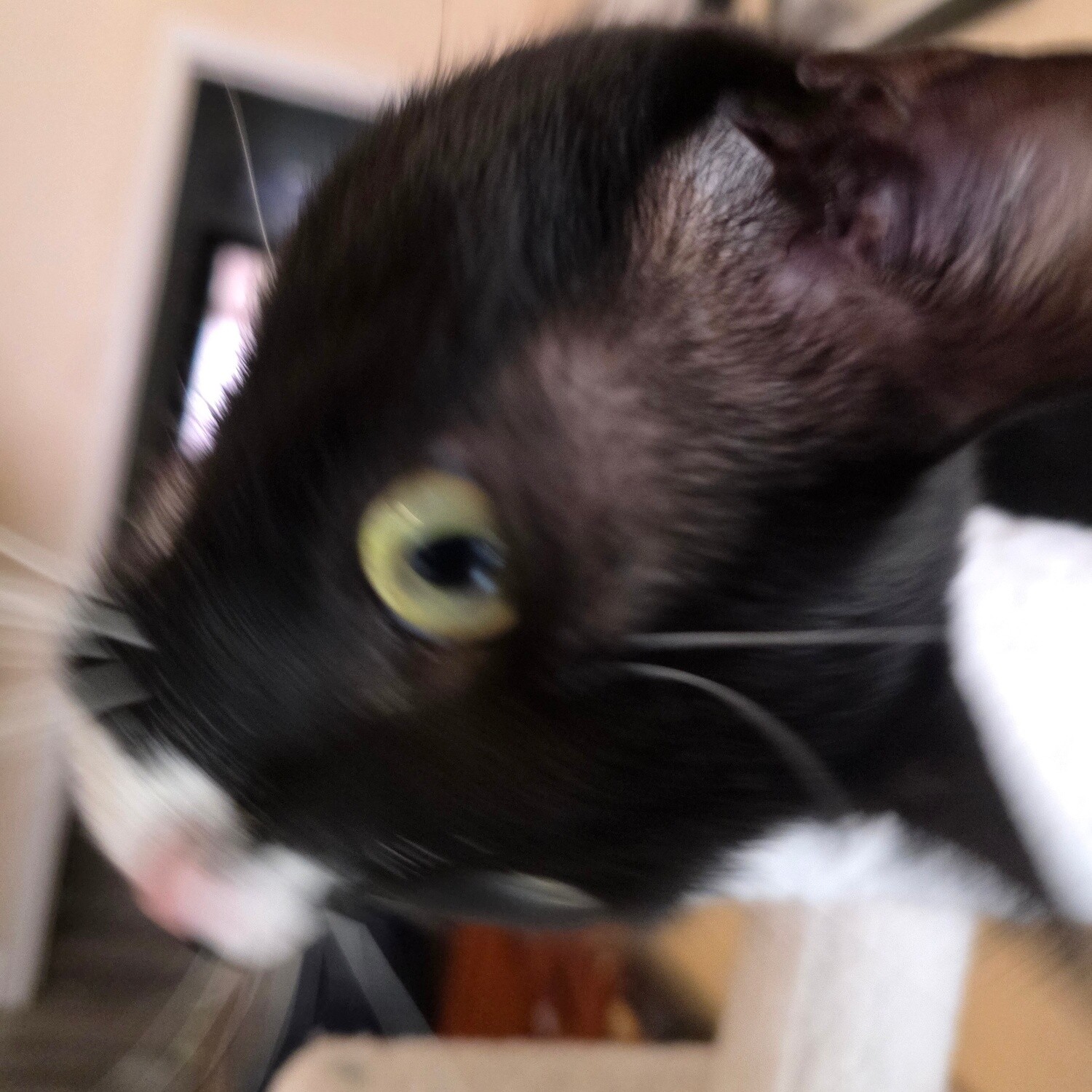
and pixelized it into

and fixed it up a bit for this weekly.

I love him very much.
8 Likes
Great job! I love some SPOOKY SCARY art
1 Like
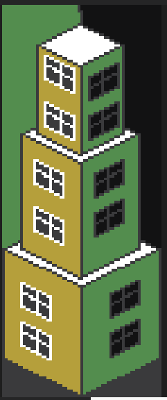
a fun thing i made

i learned how to do an iso in pixelart when doing this might make some more and post it with this palette
6 Likes
Nice! My favourite method is to make a basic cube and copy and paste it to build larger forms. It makes sure that yr lines are parallel with each other
4 Likes